REPORT
11 Sustainable Aviation
Trends for 2023
11 Sustainable Aviation Trends for 2023
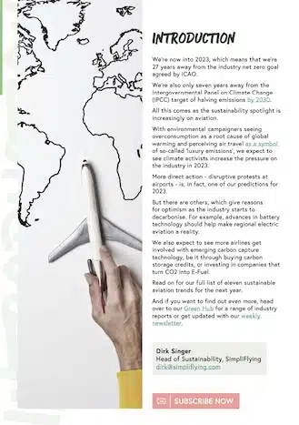
Our new trends report looks at how and why the battle for
climate action is expected to grow more heated this year.
There’s reason for both hope and concern. Explore 11
sustainable aviation trends for 2023.
Our new trends report looks at how and why the battle for climate action is expected to grow more heated this year. There’s reason for both hope and concern. Explore 11 sustainable aviation trends for 2023.
The year of upheaval
With environmental campaigners seeing overconsumption as a root cause of global warming and perceiving air travel as a symbol of so-called ‘luxury emissions’, we expect to see climate activists increase the pressure on the industry in 2023.
More direct action – disruptive protests at airports – is, in fact, one of our predictions for 2023.
But there are others, which give reasons for optimism as the industry starts to decarbonise.
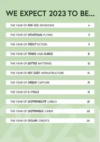
11 Key Trends for 2023
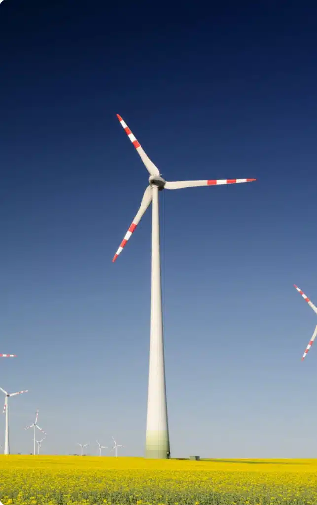
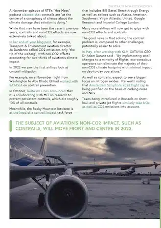
The year of Non-CO2 emissions
The subject of aviation’s non-CO2 impact, such as contrails, will move front and centre in 2023.
The year of intentional flying
In 2023, we expect to see more people making more careful flight choices, such as choosing the least carbon-intensive route, combining business trips and vacations, or even swapping short flights for the train.
The year of direct action
We will see more disruptive climate change protests at airports, for example, runway occupations.
Explore 8 more trends in our exclusive report!